The default setting of a MacBook’s touch bar is that of ‘Control Strip’. This strip has controls to manage volume, brightness and multimedia playback on your Mac. It also has a button for Siri and you can, or not, find it useful. The arrival of Siri to macOS It was something important, but it has not lived up to its potential. Siri cannot open an application in MacOS. If Siri doesn’t help you much, you can remove it from the touch bar quite easily. Here is the how.
Remove Siri from the touch bar
There are two ways to remove Siri from the Touchbar. The first and simple method is to remove the control strip. All you have to do is uncheck a small option. The second method is also simple and allows you to keep the control strip but remove Siri from it.
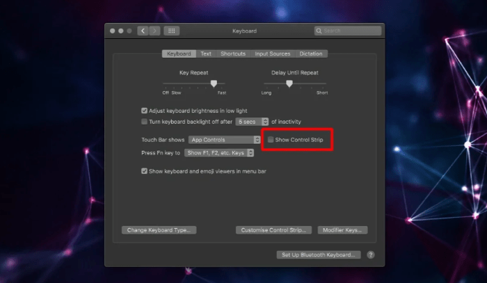
Open the System Preferences application and go to the Keyboard preference. Uncheck the option ‘Show Control Strip’ and the Control Strip will no longer appear on the Touch Bar.

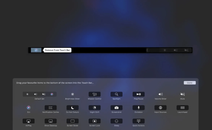
If you like the control strip and just want to remove Siri from the touch bar, click on the “Customize the control strip” button in the keyboard preference. This will take you to the edit mode of the touch bar. Expand the Control Strip. Drag the Siri button from the bar and drop it on the garbage bin icon on the left edge.

Click Done, and that will do the trick. The Control Strip, whether it is collapsed or expanded, will no longer display the Siri button.

Each time you want to retrieve the Siri button, you must open the System Preferences application and select the Keyboard preference again. Click on the “Customize the control strip” button and you will see a full panel of buttons appear at the bottom of the screen. There will be a Siri button there. Drag and drop it on the Touch Bar, and it will be added back to the Control Band.
Final steps
The Touch Bar is hit and failed. Some users love it, others don’t. If you don’t like it, you can disable it or try to get some other use. There are applications that can add additional buttons and functions to the Touch Bar. You can, for example, add a clock to the touch bar or even add the Dock.
The virtual assistant button may be useful, but it is badly placed in the corner, where it is easy to tap by accident and that can only be reason enough for users to want to remove it.